primary
#510836
secondary
#06717b
accent
#d22d4a
background
#ece5e0
text
#510836
Oswald for headings, Area Normal for body - tokens generated 2026-08-25
Campaigns
3 pages
Brand colours
Generated scales, exact surfaces and alpha helpers
Strawberry
400
#c02441
500
#d22d4a
700
#510836
850
#46002d
Cream
200
#f3ebe6
300
#ece5e0
600
#dacec4
Turquoise
300
#24ada2
500
#009e92
700
#06717b
800
#00636b
Pink
200
#f0c6fb
500
#d393e3
Yellow
300
#ffe792
Orange
500
#ff8200
Surfaces and helpers
White/50
#ffffff
Black/900
#19191a
Alpha/White 96%
rgba(255,255,255,0.96)
Alpha/White 48%
rgba(255,255,255,0.48)
Alpha/White 24%
rgba(255,255,255,0.24)
Alpha/White 12%
rgba(255,255,255,0.12)
Alpha/White 8%
rgba(255,255,255,0.08)
Alpha/White 4%
rgba(255,255,255,0.04)
Alpha/Black 24%
rgba(25,25,26,0.24)
Alpha/Black 12%
rgba(25,25,26,0.12)
Colour schemes
One mode per section colour. Values alias into the brand scales.
Beige
- Background/Background
- Background/Background Overlay
- Background/Foreground
- Border/Divider
- Border/Image Border
- Text/Heading
- Text/Default
- Text/Alternate
- Text/Accent
- Button/Primary/Default/Text
- Button/Primary/Default/Background
- Button/Primary/Default/Border
- Button/Primary/Hovered/Text
- Button/Primary/Hovered/Background
- Button/Primary/Hovered/Border
- Button/Secondary/Default/Text
- Button/Secondary/Default/Background
- Button/Secondary/Default/Border
- Button/Secondary/Hovered/Text
- Button/Secondary/Hovered/Background
- Button/Secondary/Hovered/Border
- Button/Slider Button/Default/Text
- Button/Slider Button/Default/Background
- Button/Slider Button/Default/Border
- Button/Slider Button/Hovered/Text
- Button/Slider Button/Hovered/Background
- Button/Slider Button/Hovered/Border
- Button/Form Button/Default/Text
- Button/Form Button/Default/Background
- Button/Form Button/Default/Border
- Button/Form Button/Hovered/Text
- Button/Form Button/Hovered/Background
- Button/Form Button/Hovered/Border
- Tags/Tag 1/Text
- Tags/Tag 1/Background
- Tags/Tag 1/Background Overlay
- Tags/Tag 2/Text
- Tags/Tag 2/Background
- Tags/Tag 2/Background Overlay
- Tags/Tag 3/Text
- Tags/Tag 3/Background
- Tags/Tag 3/Background Overlay
Dark Mode
- Background/Background
- Background/Background Overlay
- Background/Foreground
- Border/Divider
- Border/Image Border
- Text/Heading
- Text/Default
- Text/Alternate
- Text/Accent
- Button/Primary/Default/Text
- Button/Primary/Default/Background
- Button/Primary/Default/Border
- Button/Primary/Hovered/Text
- Button/Primary/Hovered/Background
- Button/Primary/Hovered/Border
- Button/Secondary/Default/Text
- Button/Secondary/Default/Background
- Button/Secondary/Default/Border
- Button/Secondary/Hovered/Text
- Button/Secondary/Hovered/Background
- Button/Secondary/Hovered/Border
- Button/Slider Button/Default/Text
- Button/Slider Button/Default/Background
- Button/Slider Button/Default/Border
- Button/Slider Button/Hovered/Text
- Button/Slider Button/Hovered/Background
- Button/Slider Button/Hovered/Border
- Button/Form Button/Default/Text
- Button/Form Button/Default/Background
- Button/Form Button/Default/Border
- Button/Form Button/Hovered/Text
- Button/Form Button/Hovered/Background
- Button/Form Button/Hovered/Border
- Tags/Tag 1/Text
- Tags/Tag 1/Background
- Tags/Tag 1/Background Overlay
- Tags/Tag 2/Text
- Tags/Tag 2/Background
- Tags/Tag 2/Background Overlay
- Tags/Tag 3/Text
- Tags/Tag 3/Background
- Tags/Tag 3/Background Overlay
Red
- Background/Background
- Background/Background Overlay
- Background/Foreground
- Border/Divider
- Border/Image Border
- Text/Heading
- Text/Default
- Text/Alternate
- Text/Accent
- Button/Primary/Default/Text
- Button/Primary/Default/Background
- Button/Primary/Default/Border
- Button/Primary/Hovered/Text
- Button/Primary/Hovered/Background
- Button/Primary/Hovered/Border
- Button/Secondary/Default/Text
- Button/Secondary/Default/Background
- Button/Secondary/Default/Border
- Button/Secondary/Hovered/Text
- Button/Secondary/Hovered/Background
- Button/Secondary/Hovered/Border
- Button/Slider Button/Default/Text
- Button/Slider Button/Default/Background
- Button/Slider Button/Default/Border
- Button/Slider Button/Hovered/Text
- Button/Slider Button/Hovered/Background
- Button/Slider Button/Hovered/Border
- Button/Form Button/Default/Text
- Button/Form Button/Default/Background
- Button/Form Button/Default/Border
- Button/Form Button/Hovered/Text
- Button/Form Button/Hovered/Background
- Button/Form Button/Hovered/Border
- Tags/Tag 1/Text
- Tags/Tag 1/Background
- Tags/Tag 1/Background Overlay
- Tags/Tag 2/Text
- Tags/Tag 2/Background
- Tags/Tag 2/Background Overlay
- Tags/Tag 3/Text
- Tags/Tag 3/Background
- Tags/Tag 3/Background Overlay
Blue
- Background/Background
- Background/Background Overlay
- Background/Foreground
- Border/Divider
- Border/Image Border
- Text/Heading
- Text/Default
- Text/Alternate
- Text/Accent
- Button/Primary/Default/Text
- Button/Primary/Default/Background
- Button/Primary/Default/Border
- Button/Primary/Hovered/Text
- Button/Primary/Hovered/Background
- Button/Primary/Hovered/Border
- Button/Secondary/Default/Text
- Button/Secondary/Default/Background
- Button/Secondary/Default/Border
- Button/Secondary/Hovered/Text
- Button/Secondary/Hovered/Background
- Button/Secondary/Hovered/Border
- Button/Slider Button/Default/Text
- Button/Slider Button/Default/Background
- Button/Slider Button/Default/Border
- Button/Slider Button/Hovered/Text
- Button/Slider Button/Hovered/Background
- Button/Slider Button/Hovered/Border
- Button/Form Button/Default/Text
- Button/Form Button/Default/Background
- Button/Form Button/Default/Border
- Button/Form Button/Hovered/Text
- Button/Form Button/Hovered/Background
- Button/Form Button/Hovered/Border
- Tags/Tag 1/Text
- Tags/Tag 1/Background
- Tags/Tag 1/Background Overlay
- Tags/Tag 2/Text
- Tags/Tag 2/Background
- Tags/Tag 2/Background Overlay
- Tags/Tag 3/Text
- Tags/Tag 3/Background
- Tags/Tag 3/Background Overlay
Typography
Font size is the only bound variable. Line height and tracking live on the style.
Heading/Display
100 / 56px - 600 - 100%
The quick brown fox
Heading/Heading 1
64 / 40px - 600 - 100%
The quick brown fox
Heading/Heading 2
58 / 32px - 600 - 120%
The quick brown fox
Heading/Heading 3
42 / 28px - 600 - 110%
The quick brown fox
Heading/Heading 4
36 / 24px - 700 - 130%
The quick brown fox
Heading/Heading 5
28 / 20px - 700 - 130%
The quick brown fox
Heading/Heading 6
28 / 14px - 700 - 130%
The quick brown fox
Text/Eyebrow/Small
16 / 16px - 600 - 26px
The quick brown fox
Text/Small/Regular
16 / 16px - 400 - 150%
The quick brown fox
Text/Small/Semi-Bold
16 / 16px - 600 - 150%
The quick brown fox
Text/Small/Black
16 / 16px - 900 - 150%
The quick brown fox
Text/xSmall/Regular
14 / 14px - 400 - 150%
The quick brown fox
Text/xSmall/Semi-Bold
14 / 14px - 600 - 150%
The quick brown fox
Text/xSmall/Bold
14 / 14px - 700 - 150%
The quick brown fox
Text/xSmall/Black
14 / 14px - 900 - 150%
The quick brown fox
Text/xxSmall/Regular
12 / 12px - 400 - 150%
The quick brown fox
Spacing, radius and layout
Desktop (1440) and Mobile (393) modes
General
Gutter
40 / 20
Horiztonal Padding
Horiztonal Padding/Medium
80 / 24
Vertical Padding
Vertical Padding/Medium
112 / 48
Spacing
Spacing/xSmall
8 / 8
Spacing/Small
12 / 12
Spacing/Medium
16 / 16
Spacing/Large
24 / 20
Spacing/xLarge
32 / 24
Spacing/xxLarge
48 / 28
Spacing/Huge
64 / 32
Spacing/xHuge
96 / 48
Button
Button/Primary/Mask Height
21 / 21
Button/Primary/Padding Left
24 / 24
Button/Primary/Padding Right
16 / 16
Button/Primary/Padding Top
16 / 16
Button/Primary/Padding Bottom
16 / 16
Max-Width
Max-Width/Large
1312 / 353
Max-Width/Medium
968 / 353
Max-Width/Small
840 / 353
Radius
Radius/Small
8 / 8
Radius/Medium
12 / 12
Radius/Large
16 / 16
Radius/Button
100 / 100
Assets
12 files in /clients/pennyfinance-com-au/assets

cta-couple-home.jpg
79 KB
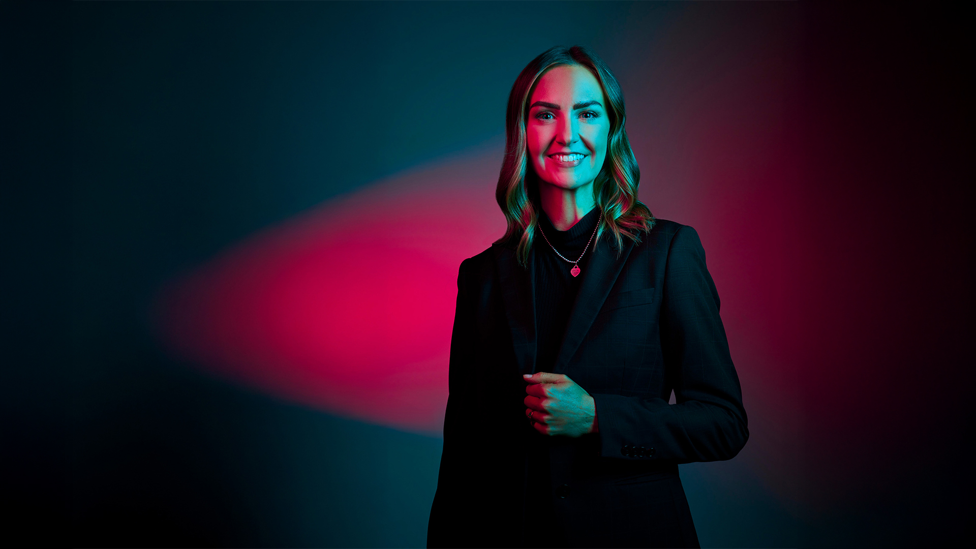
home-hero-morgan.jpg
588 KB

icon-facebook.svg
471 B

icon-instagram.svg
2 KB

icon-tiktok.svg
549 B

logo.png
1 KB

partner-anderson.png
45 KB

partner-blueocean.png
10 KB

partner-fountain-law.png
5 KB

partner-overdrive.png
12 KB

partner-peritum.png
8 KB

partner-sfg.png
4 KB